UI kit vs section library vs template: which do you need?
Clear definitions of a UI kit, a section library and a website template, when each is the right buy, and how the three combine on a real startup site.
A UI kit is a set of design building blocks (type, colour, buttons, inputs, cards) that you assemble into your own screens. A section library is a set of ready page sections (heroes, pricing tables, feature grids, footers) that you stack into pages. A template is a complete website with every page already designed, written and linked. Buy a UI kit to design a product, a section library to build pages quickly in your own style, and a template to ship a whole site fast.
The three get mixed up because sellers use the words loosely, and because they overlap: a good template contains a UI kit's worth of components and a section library's worth of sections. The difference is how finished the thing is when you receive it, and how much design work is still yours.
Definitions that hold up
UI kit
A UI kit is the smallest unit: the parts a designer or developer uses to build an interface. Typically that means a type scale, a colour palette, buttons in their states, form inputs, cards, badges, navigation pieces and icons. Some kits include sample screens to show the parts in use.
A UI kit leaves layout and content decisions to you. It is best for product work, where you are designing app screens that no website template will cover: dashboards, settings, onboarding flows.
Section library
A section library sits one level up. Each item is a full-width block of a page: a hero, a logo strip, a feature grid, a testimonial row, a pricing table, a FAQ, a call to action, a footer. You pick sections and stack them to make pages.
A section library leaves the page plan, the copy and the overall consistency to you. Sections from the same library usually share spacing and type, so pages look related, but nobody has decided which sections your pricing page needs or in what order.
Template
A template is a finished website. Pages are designed, sections are chosen and ordered, copy is written for a realistic product, and the pages link to each other: navigation, footer, blog index to post, pricing to sign-up. You replace the content and ship.
A template leaves less to you, which is the point. Our post on what a complete template includes lists the pages we think a startup site needs, including the unglamorous ones like 404, password, coming soon, licences and a style guide.
Side by side
| UI kit | Section library | Template | |
|---|---|---|---|
| Unit | Components and tokens | Page sections | Whole pages and a whole site |
| You still decide | Layout, sections, pages, copy | Which sections, page plan, copy | Your copy, images and any new pages |
| Best for | App and product screens | Building pages in a consistent style | Shipping a marketing site fast |
| Typical user | Product designer, front-end developer | Designer or developer building many pages | Founder, marketer, small team |
| Time to a live site | Longest | Medium | Shortest |
When to use each
Use a UI kit when:
- You are designing the product itself, not the marketing site.
- You need your app and your site to share the same buttons, inputs and colours.
- You have a designer who wants control over every layout.
Use a section library when:
- You already have a site and need new pages that match it.
- You build many landing pages for campaigns and want them consistent without designing each one.
- You work with a coding agent and want it to assemble pages from real, designed sections instead of inventing them.
Use a template when:
- You need a complete site, live soon, and do not have a designer on the team.
- You want the hard pages solved: pricing with plan comparison, changelog, careers, security, contact with success states.
- You want copy written for your kind of product so you can see real headline lengths before you write your own.
How the three combine
On a real startup, you often end up using all three, layered.
- Start the marketing site from a template. It gives you the page plan, the visual direction and working pages on day one.
- Use the template's style guide and tokens as the shared source of truth: fonts, colours, spacing.
- Use a UI kit in the same style for product screens, so sign-in and the app feel like the same company as the site.
- When you need a page the template does not have, assemble it from sections that match, rather than designing from scratch.
The failure mode to avoid is mixing sources with different design systems. A hero from one library, a pricing table from another and buttons from a third kit will each look fine alone and wrong together. Whatever you combine, make sure it shares tokens, or plan time to align them.
What Frontier offers at each level
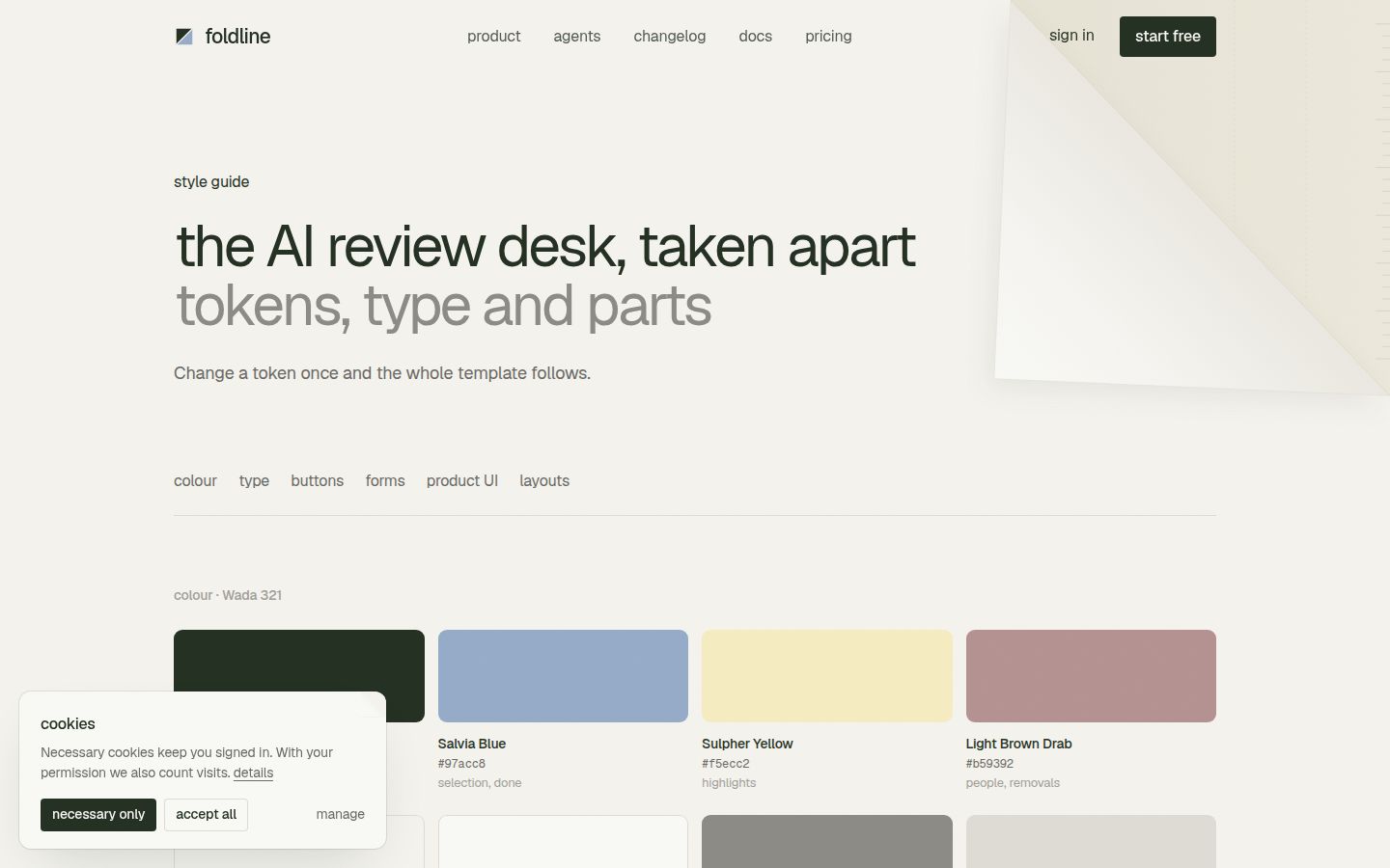
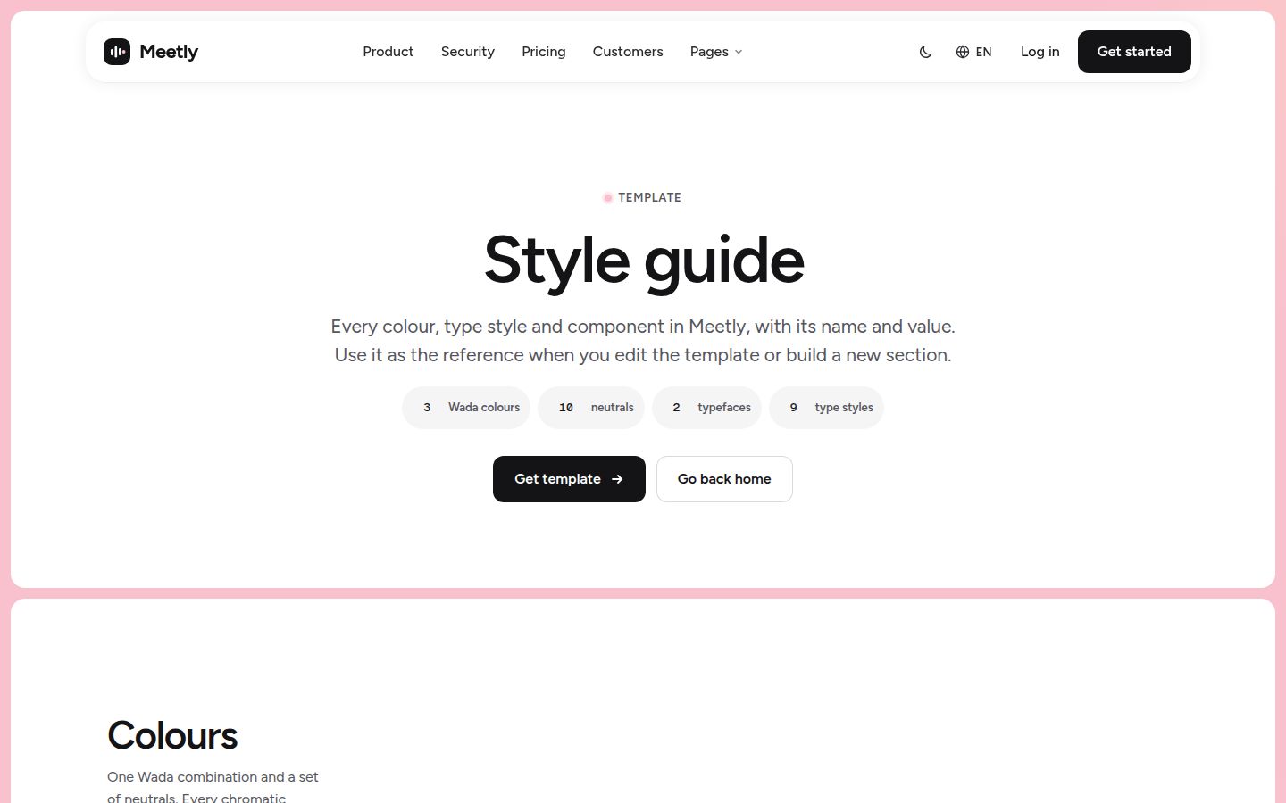
Templates are our main product. Each one is a complete site, and one purchase of $79 covers every format it ships in, with formats still in production included when they ship. Every template we sell comes with a start-here guide or style guide among its pages, so you can see the tokens and components the site is built from.
UI kits: three of our templates have a UI kit ready today: Meetly, our AI meeting assistant template; Relay, for AI agent platforms; and Foldline, for AI code review. The UI kit is one of the extras ready for those three templates. Browse them together in SaaS UI kits.
Sections: the MCP server gives Claude Code, Cursor and Codex real sections, design tokens and page blueprints from our templates. That makes it a section library your coding agent can use directly in your own project. Free sections work without a key. Setup for Claude Code is one command:
claude mcp add frontier -e FRONTIER_LICENSE_KEY=ft_your_key -- npx -y @frontiertemplates/mcpCursor and Codex configuration is on the MCP page, and our post on the design MCP server explains how an agent uses it.
So the layers map like this:
- Need a whole site: a template, in Framer, Astro, HTML or as a prompt pack, depending on what each template ships in today.
- Need product screens: the template's UI kit, where one is ready.
- Need more pages in your own project: sections from the MCP server.
What to check before you buy any of them
The checks differ a little by level, because each one fails in a different way.
- UI kit: look for every state, not only the default. Buttons need hover, focus, disabled and loading; inputs need error and help text. Check that colours are defined as tokens, not repeated values, so a rebrand is one change.
- Section library: stack five sections from different categories on one test page. If the spacing between them is uneven or the type sizes drift, you will spend your time fixing seams instead of building pages.
- Template: open the pages people skip in demos (pricing on a phone, a long blog post, the 404, a form after submission). Those show whether the whole site was finished or only the home page.
- All three: read the licence for client work and for how many sites or people it covers. Website template licences explained walks through the usual terms.
Questions that settle it
If you are still unsure, these usually decide it:
- Are you building a product interface or a marketing site? Product interface points to a UI kit.
- Do you already have a site whose style you want to keep? That points to sections.
- Is anyone on the team going to design page layouts? If not, a template.
- Will a coding agent do much of the building? Sections and tokens over MCP, or a template's prompt pack, give it real design material to work from. See editing a template with Claude Code for the workflow.
For more on judging what you buy at any level, see how to judge a premium website template.
Changelog
- 2026-10-05: first published