SaaS pricing page anatomy: every part and why it is there
The parts of a SaaS pricing page, from plan cards and billing toggles to comparison tables, calculators and FAQ, plus the mistakes that cost trust.
A good SaaS pricing page answers three questions in order: which plan is for me, what will I actually pay, and what happens if I pick wrong. The parts that do that work are plan cards, a monthly and yearly toggle, a full comparison table, a usage calculator when price depends on volume, an FAQ, a route to sales for larger buyers and trust details near the buttons. Everything else is decoration.
The pricing page is the page buyers return to most and the one teams redesign least, because changing it feels risky. This guide takes it apart piece by piece, with examples from our own SaaS website templates, so you can see what each part is for and decide which ones your product needs.
Plan cards: the first screen
Plan cards are the summary. Each one needs a name, a price with its unit, one line on who it is for, the main limits and one button. Three or four cards is the usual range; past that, visitors stop comparing and start skimming.
What makes plan cards work:
- Name plans for the buyer, not the vendor. "Team" and "Business" tell a visitor where they fit. Gemstones and planets make them read the small print to find out.
- Put the unit next to the price. Per seat, per month, per workspace, per thousand runs. A price without a unit is a question.
- Lead each card with what changes. List the differences from the plan below, not every feature again. "Everything in Starter, plus" is a useful phrase.
- One recommended plan, at most. Highlight the plan most buyers should pick and say why in a few words.
- One button per card. Start free, start trial or talk to sales. Do not offer a choice inside the card.
The monthly and yearly toggle
If you offer annual billing, put the toggle above the cards and make its state obvious. Three details are easy to get wrong:
- Say what the yearly price means. Show the per-month equivalent and the amount billed once a year, so nobody is surprised at checkout.
- State the saving in money or months, not just a badge. "Two months free" is clearer than a percentage most people cannot check in their heads.
- Keep the default honest. Defaulting to yearly makes the numbers look smaller, and buyers notice when the checkout total does not match the card they clicked.
The toggle should be a real control that keyboard users can operate, with the selected option announced clearly. Build it as a pair of radio buttons or a proper switch, not two styled links.
The comparison table
The plan cards summarise; the comparison table settles arguments. It is where the person who has to justify the purchase goes to check one specific feature on one specific plan.
A comparison table that does its job:
- Groups rows into sections (collaboration, security, admin, support) so it can be scanned.
- Repeats plan names in a sticky header so a row deep in the table still makes sense.
- Uses words or values where a tick hides the answer: "30 days" beats a tick for history retention.
- Works on a phone, either by scrolling inside its own container or by switching to one plan at a time.
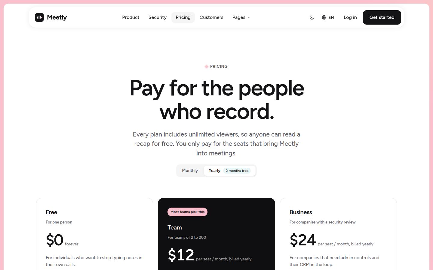
Meetly, our AI meeting assistant template, ships pricing with a plan comparison, written with real pricing rows for a meeting-notes product. Foldline, built for AI code review, also includes pricing with a plan comparison. Seeing real row labels in a demo is the quickest way to judge whether a table will hold your own features.
Calculators for usage-based pricing
When price depends on volume (tokens, minutes, runs, seats that change month to month), plan cards alone cannot answer "what will I pay". A usage calculator can. The visitor sets their expected volume and the page shows the cost, ideally with the plan that fits.
Two kinds of calculator belong near pricing:
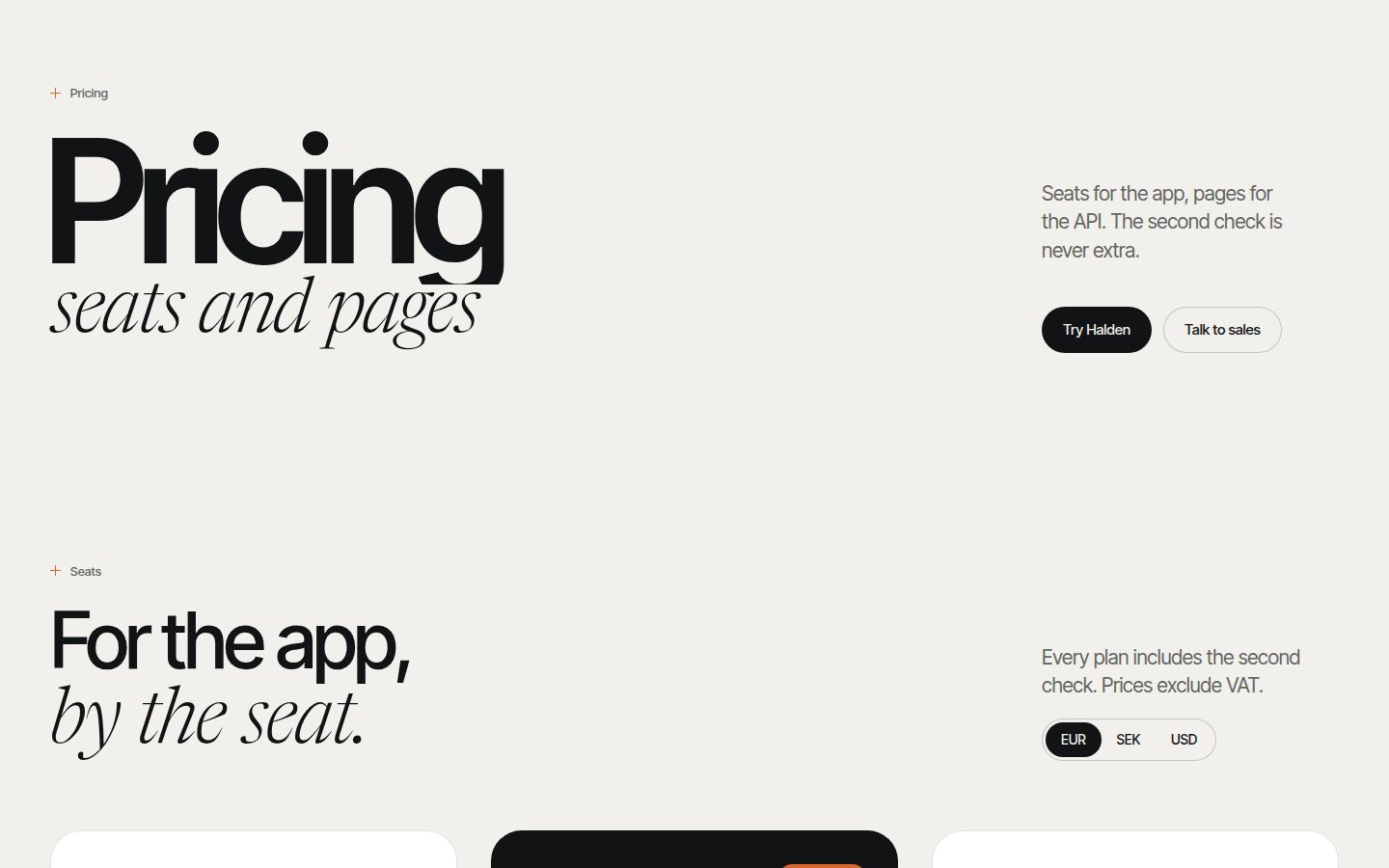
- A usage calculator answers what the product will cost. Halden, our AI lab template, ships pricing with a usage calculator, which suits API products billed on consumption.
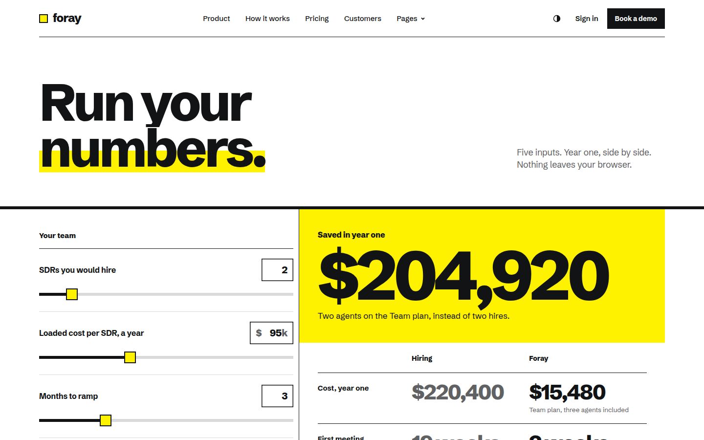
- A return calculator answers what the product is worth. Foray, our AI sales agent template, has an interactive ROI calculator page where the visitor enters their own numbers.
Keep the arithmetic transparent. Show the formula or the unit prices under the result, round in the buyer's favour when you round at all, and never pre-fill a calculator with the best possible case. A calculator that flatters is worse than none, because the buyer will redo the sums on their own spreadsheet.
FAQ, enterprise and trust
The FAQ
The pricing FAQ is where you answer the objections that block a purchase. Write it from real sales and support questions, not from a list of things you want to say. The usual ones: what happens at a limit, how upgrades and downgrades are billed, whether there is a trial and what happens when it ends, how cancellation works, which payment methods and currencies you accept, and whether there are discounts for startups, education or non-profits.
Answer each in two or three sentences. If an answer needs a page, link to it.
The enterprise or contact route
Larger buyers need a different path: security review, invoicing, custom terms, single sign-on. Give them a card or a band that says what the enterprise plan adds and a button to contact sales. Do not hide the self-serve plans behind it, and do not make the contact form longer than it needs to be. Name, work email, company size and one free-text field is enough to start a conversation.
Trust near the buttons
Put the reassurance where the decision happens: next to or under the plan buttons. Short lines work best: whether a card is required for the trial, how cancellation works, who handles billing, and a link to the security page. Customer logos and quotes help only if they are real; a band of invented logos is worse than an empty space.
Common mistakes
Most pricing pages fail in the same handful of ways:
| Mistake | Fix |
|---|---|
| Price with no unit | Write per seat, per month or per run next to every number |
| Plans that differ in ten small ways | Pick the two or three limits that actually separate plans |
| Feature names only the product team understands | Use the words buyers use in sales calls |
| Yearly default with no billed-annually total | Show the per-month figure and the annual amount together |
| Comparison table that breaks on phones | Scroll it inside its own box or show one plan at a time |
| "Contact us" as the only price | Show self-serve prices; reserve contact for enterprise |
| Unsourced claims about savings or results | Replace with a calculator the visitor fills in |
| No FAQ, or an FAQ of marketing lines | Answer real billing and limit questions plainly |
A note on numbers: you will find plenty of confident advice about which layout, colour or plan count converts best. Treat it as a hypothesis for your own product, and test it on your own traffic before you believe it.
Putting the page in order
A reliable order from top to bottom:
- A one-line headline that says who the pricing is for.
- The monthly and yearly toggle.
- Plan cards, with one recommended plan.
- A short trust line under the buttons.
- A calculator, if price depends on usage.
- The full comparison table.
- The enterprise or contact band.
- The FAQ.
If you are building a site from scratch, start with a template whose pricing page already has these parts in your category's language, then rewrite the rows for your product. Our guide to judging a premium website template has a checklist for that, and what an AI agent website needs covers the pages that sit next to pricing for agent products.
Changelog
- 2026-10-05: first published