Sections / Gems / Image and video motion heroes
Prism Slats
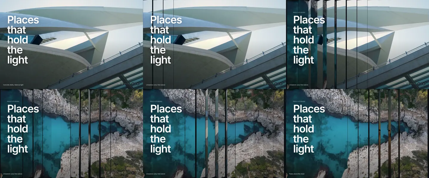
A full-bleed image hero cut into vertical three-sided slats. Each change turns the slats one face in a staggered wave, and the pointer drags a crease through them that shows a sliver of the previous and next image on either side. Pure CSS 3D and a few lines of script: no WebGL, no dependencies.
Free
- Kind
- Image and video motion heroes
- Interaction
- autoplay · pointer crease · 3D slats · keyboard · swipe · carousel
- Dependencies
- None
- Licence
- Free for personal and commercial sites; do not resell the gem itself
Formats
- HTML
- Claude Code
- React
HTML is one module and one stylesheet (Webflow: paste it into an Embed). React is one typed file for Next.js and Framer. The Claude Code prompt carries the exact files and where they go, so your agent installs this gem, not a lookalike. With the MCP server, ask your agent for get_section("prism-slats").
Behaviour and accessibility
- Pauses its autoplay while hovered or focused, and stops drawing entirely when off screen or in a background tab.
- Arrow keys change the image when focus is inside it; the arrow buttons are labelled; each change is announced politely to screen readers and the stage carries the current image's alt text.
- Swipe left and right on touch screens; the pointer crease is mouse and pen only.
- With prefers-reduced-motion: no autoplay, no crease, and a change cuts instead of turning.
- Anything you put inside the element (a headline, buttons) sits above the slats in a .psh-content layer.
Options
| Option | Type | Default | What |
|---|---|---|---|
slides | PrismSlide[] | 5 built in | The images, in order. Two or more. |
slats | number | 0 | Number of slats. 0 picks by width: 7 under 640 px, 11 under 1024 px, else 14. |
interval | number | 5200 | Milliseconds between changes; 0 turns autoplay off. |
duration | number | 1150 | Milliseconds one slat takes to turn. |
stagger | number | 55 | Milliseconds between neighbouring slats starting their turn. |
tilt | number | 48 | Largest twist under the pointer, in degrees. 0 turns the crease off. |
controls | boolean | true | Show the caption, counter, progress and arrow buttons. |
label | string | "Featured images" | Accessible name of the carousel. |
startIndex | number | 0 | Slide shown first. |
onChange | (index: number) => void | Called after every change with the new index. |

