Website template accessibility: a practical checklist
A practical checklist for judging a website template's accessibility before you buy: landmarks, focus, keyboard menus, contrast, motion, forms and reflow.
To judge a website template's accessibility, check ten things on its live demo: semantic landmarks, a sensible heading outline, visible focus states, menus that work by keyboard, text and control contrast against WCAG 2.2 AA, behaviour under reduced motion, alt text, forms with real labels and text errors, and a layout that reflows at 320 CSS pixels wide. Then run an automated scan, tab through a page, and listen to it with a screen reader. Half an hour on a demo tells you more than any badge.
A template is the foundation every page of your site inherits, so its accessibility problems become your problems on every page. Fixing a missing focus style in one component is easy; discovering after launch that the menu cannot be opened by keyboard on any page is not. This checklist is what we look for, written so you can apply it to any template from any seller, including ours.
Note: A note on claims: no checklist, including this one, makes a site compliant. The reference is the [WCAG 2.2](https://www.w3.org/TR/WCAG22/) recommendation itself, and real compliance depends on your final content too. Treat sellers' "accessible" badges, ours included, as a starting point to verify.
1. Structure: landmarks and headings
Screen reader users jump around a page by landmarks and headings, much as sighted users scan. Open the demo, view the source or the browser's accessibility tree, and check:
- One header, one nav (or several, each with an accessible label), one main and one footer, using the HTML elements rather than divs with classes.
- A skip link as the first focusable element, which jumps to main.
- Exactly one h1 per page, describing the page.
- Headings that nest in order (h2 under h1, h3 under h2), chosen for structure rather than for size. A template that uses h4 because it "looked right" will mislead every page you build from it.
- Lists marked up as lists, and buttons that are button elements rather than clickable divs.
2. Focus states and keyboard navigation
Focus states
Press Tab on the home page and watch. WCAG 2.2 Focus Visible requires a visible keyboard focus indicator, and the newer Focus Not Obscured (Minimum) requires that the focused item is not entirely hidden by author-created content such as a sticky header or a cookie banner.
- Every link, button and field shows a clear focus ring.
- The ring is visible on every background the template uses, including dark sections and images.
- Focus never disappears behind a sticky header when you tab down the page.
- Focus order follows the visual order.
Templates often remove the outline globally and forget to replace it. If you see outline: none in the CSS without a :focus-visible style nearby, expect trouble.
Menus and widgets
WCAG's Keyboard criterion asks that all functionality works from a keyboard. On marketing templates the usual failures are menus and interactive mock-ups.
- The mobile menu button is a real button, opens with Enter or Space, announces its expanded state and lets you close it with Escape.
- Dropdown menus open by keyboard, not only on hover.
- Tabs, accordions, carousels, pricing toggles and calculators all work with the keyboard.
- Dialogs (cookie banners, video modals, demo forms) move focus inside when opened, keep it there, and return it when closed.
- Nothing traps focus permanently.
3. Contrast
WCAG 2.2 Contrast (Minimum) at level AA requires at least 4.5:1 for normal text and 3:1 for large text (at least 18 point, or 14 point bold). Non-text Contrast requires 3:1 for the visual parts of controls and meaningful graphics: input borders, focus rings, icons that carry meaning.
Where templates fail most often:
- Pale grey body or caption text on white.
- Text over photos, video and gradients, where contrast changes across the line.
- Placeholder text used as the only label.
- Input borders so light the field is hard to find.
- Dark mode, where muted text and accent colours were never rechecked. Our guide to dark mode for marketing sites covers that in detail.
Check the template's colour tokens rather than individual pages: if the token pairs pass, the pages built from them will too.
4. Motion and reduced motion
Animated heroes, scroll effects and playing product mock-ups are standard on modern templates. They need an off switch. The prefers-reduced-motion media feature reports when someone has asked their system to minimise non-essential motion.
- Turn on reduced motion in your operating system and reload the demo. Large movement, parallax and auto-playing sequences should stop or settle into a static state.
- Anything that moves automatically for more than five seconds needs a way to pause it, per WCAG's Pause, Stop, Hide.
- Background video should be pausable.
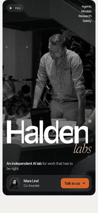
This is one area where we can be specific about our own work: the product mock-ups in templates such as Halden and Foldline are built as HTML and settle under reduced motion, rather than continuing to play.
5. Images and alt text
WCAG's Non-text Content criterion asks for text alternatives that serve the same purpose, and for purely decorative images to be ignorable by assistive technology.
- Informative images have alt text that says what matters about them, not "image" or the file name.
- Decorative images have an empty alt attribute (alt="") so screen readers skip them.
- Icon-only buttons (menu, close, social links) have an accessible name.
- Product mock-ups built as HTML expose sensible text, or are labelled as a single image with a description, rather than reading out dozens of fragments.
Remember the template's alt text describes demo content. When you replace the images, you replace the alt text.
6. Forms, labels and errors
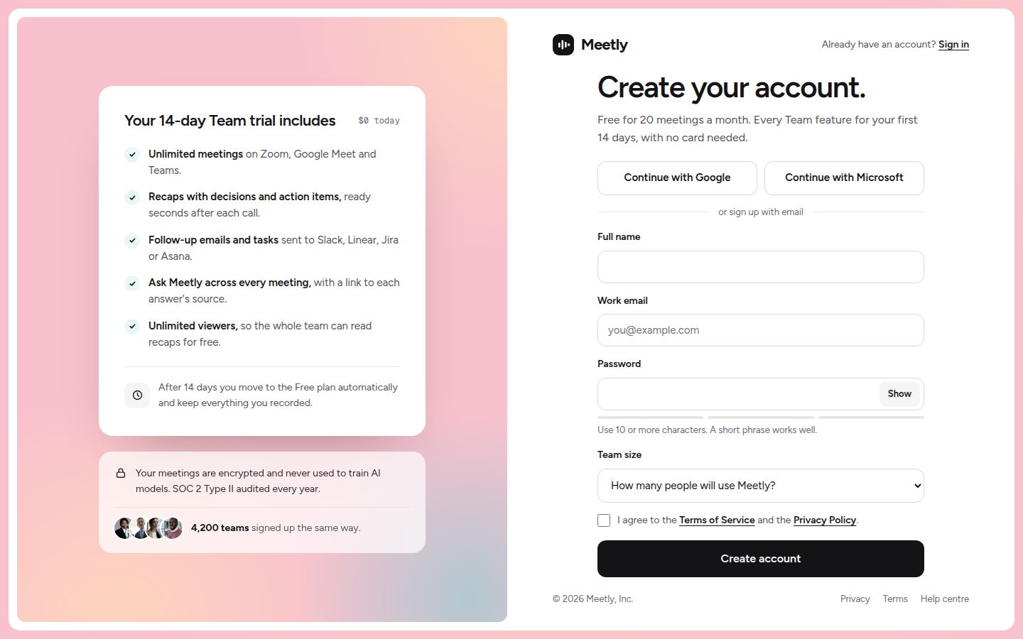
Contact, demo, sign-up and newsletter forms are where accessibility turns into lost leads. WCAG asks for labels or instructions and for errors to be identified and described in text.
- Every field has a visible label tied to it with for and id, not only a placeholder.
- Required fields are marked in text, not only with colour or an asterisk without explanation.
- Submitting an invalid form shows an error in text next to the field, and moves focus or announces the error.
- A success state exists and is announced. Many templates ship a form that does nothing visible when sent.
- Inputs use the right type and autocomplete values, so phones show the right keyboard and browsers can fill details.
Check that the template ships error and success states at all; Foray, for instance, includes forms with both. Whether they meet your standard is still for you to test.
7. Zoom, text resizing and reflow
People with low vision zoom. WCAG 2.2 Reflow asks that content works without two-direction scrolling at a width of 320 CSS pixels, which the criterion equates to a 1280-pixel-wide window at 400% zoom. Resize Text asks that text can be resized to 200 percent without losing content or function.
- Zoom the demo to 400% in a desktop browser at 1280 pixels wide, or set the window to 320 pixels. Nothing should need horizontal scrolling except things like data tables and diagrams.
- Navigation should collapse into a working menu, not overflow.
- Fixed-height containers should not clip text when it grows.
- Sticky headers and bars should not eat most of a small screen.
- Tap targets should be comfortable. WCAG 2.2 Target Size (Minimum) sets 24 by 24 CSS pixels as the AA minimum, with exceptions such as inline links.
8. How to test a template in half an hour
You do not need a lab. Use three methods together, because each catches what the others miss.
Automated scan
axe-core is an open-source accessibility testing engine with rules for WCAG 2.0, 2.1 and 2.2 at levels A, AA and AAA. Its command-line wrapper, @axe-core/cli, runs it against a URL. For a downloaded HTML template, serve the folder locally and scan a few pages:
python3 -m http.server 8080
npm install -g @axe-core/cli
axe http://localhost:8080/index.html --tags wcag2a,wcag2aa,wcag21aa,wcag22aa
The CLI drives headless Chrome, so you need Chrome and a matching ChromeDriver installed; its README explains how. Automated tools catch missing labels, contrast failures and broken ARIA quickly, and axe flags results it cannot decide as needing manual review. They cannot tell you whether alt text is meaningful or a menu makes sense, which is why the next two steps matter.
Keyboard only
Put the mouse away. Tab through the home page, the pricing page and a form. Open and close the mobile menu, any dropdown, a dialog and the cookie banner. Submit a form with errors. If you get stuck or lose track of focus, so will your visitors.
Screen reader
Turn on the screen reader built into your system (VoiceOver on macOS and iOS, Narrator on Windows, TalkBack on Android) or NVDA on Windows. Listen to the start of the home page, jump through headings and landmarks, and fill in a form. You are listening for a sensible page title, a clear heading outline, named buttons, and form errors that are actually announced.
What to ask the seller
If anything above fails, or you cannot tell, ask before you buy:
- Which WCAG level was the template designed against, and how was it tested?
- Are focus states, reduced motion and form errors handled in every component, or only some?
- How are accessibility fixes delivered to buyers after purchase?
For our own templates, ask through our support page, which is also the place to report anything you find. If you want the wider picture of what to check beyond accessibility, read how to judge a premium website template and the complete template checklist, or browse the HTML website templates, which are the easiest to inspect and test locally.
Changelog
- 2026-10-05: first published