How to judge a premium website template before you buy
Ten checks to run on any premium website template before you pay, from phone layouts and licences to editable mock-ups, with a scoring table.
What to look for in a website template comes down to one question: can you launch a real company site with it, or only a good-looking home page? Check page completeness, the phone layout, speed, accessibility basics, whether product visuals are editable, where the fonts and images come from, how updates work, the documentation, which formats actually ship today and whether the copy is real. Each check takes minutes on a live demo, and together they tell you more than any screenshot.
Most templates are sold on a hero section. The hero is the part you will change first and care about least a month after launch. The useful work is in the pages behind it, the files you will edit every week and the terms that decide whether you can use the thing for a client. Here is how we check a template, whether it is ours or anyone else's.
Start with the pages, not the hero
The fastest way to spot a thin template is to count what is missing. A pricing page with no comparison, a blog with a list but no post layout, no sign-in screen, no 404, no careers page: each gap is a page you will design yourself, usually in a hurry the week before launch, and usually in a style that does not quite match.
We wrote the full list up separately, so we will not repeat it here: the 33-page checklist for a complete template covers the pages that sell, the pages that build trust and the utility pages nobody notices until they are missing. Open the demo, click every link in the header and footer, and tick the list off as you go. If the menu links go to anchors on the home page instead of real pages, that tells you the page count on the sales page is generous.
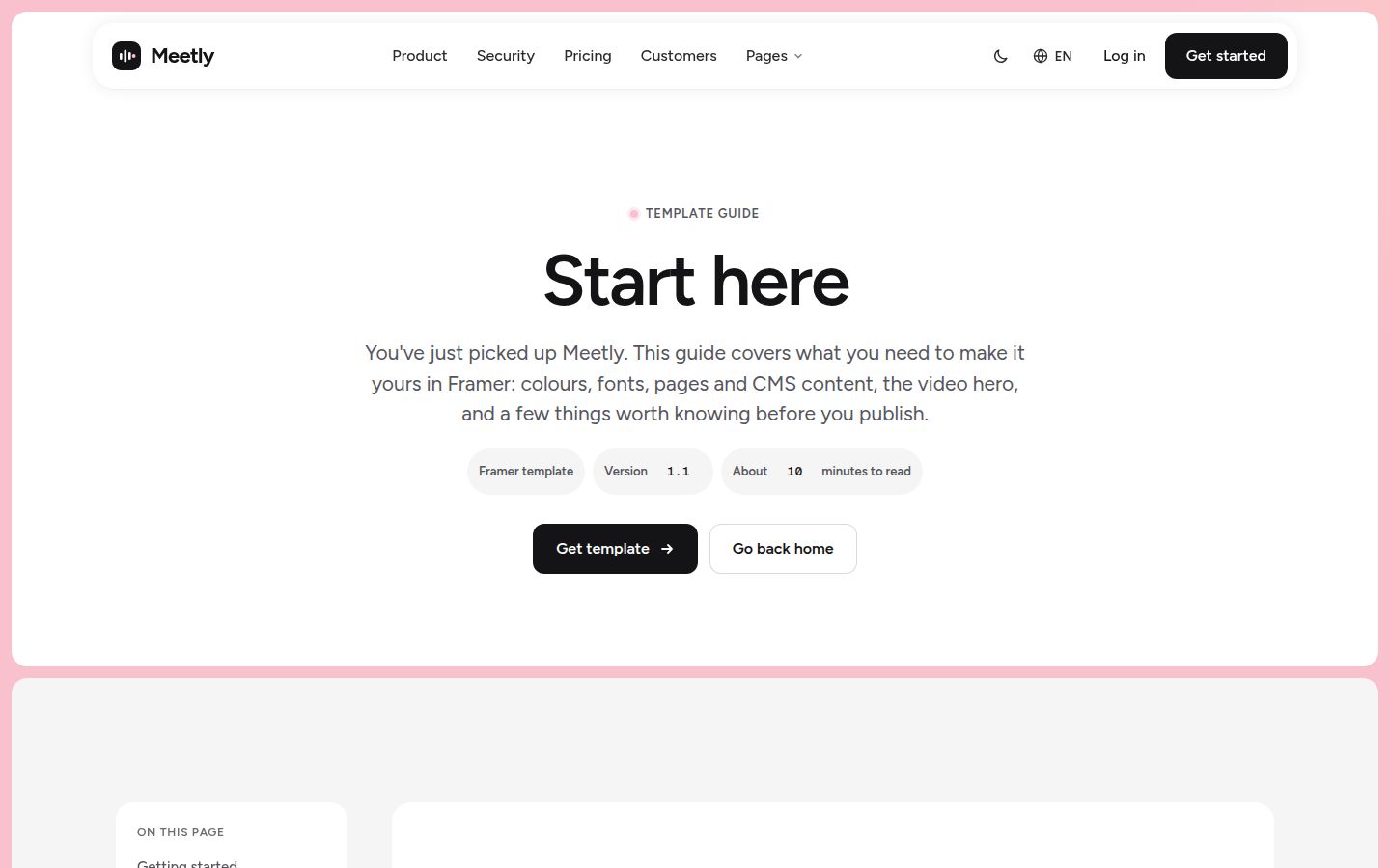
A start-here or overview page helps here too. When a template has one, it is usually the honest index of what ships.
Check the phone layout at 390 pixels
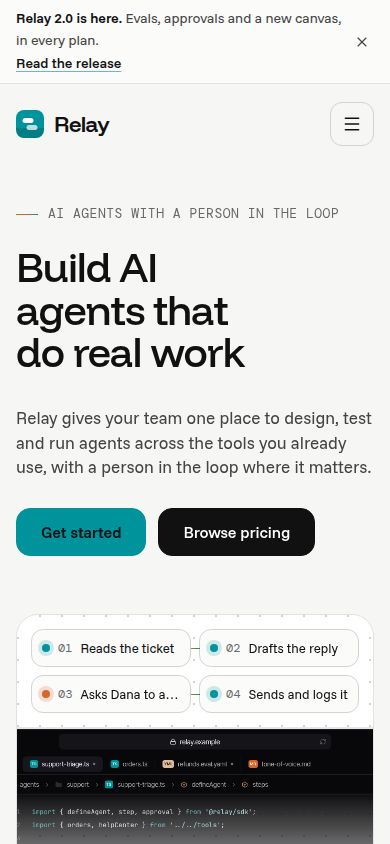
Every demo looks fine on the seller's laptop. Narrow the browser to about 390 pixels wide, roughly a common phone, or use the device toolbar in your browser's developer tools. Then look at three pages that are not the home page, because the home page is the one that got the attention.
What to look for at phone width:
- No sideways scrolling anywhere. A single wide table or code block that pushes the page out is the most common fault.
- The navigation opens, closes and can be used with a thumb.
- Pricing cards stack in a sensible order, and a comparison table either scrolls inside its own box or turns into a readable list.
- Product mock-ups scale down or swap to a simpler version instead of shrinking into unreadable miniatures.
- Forms keep their labels visible and their buttons full width.
Performance and accessibility basics
You do not need a lab to judge either. Load the demo on a phone over mobile data and notice how long it takes before you can read the headline. Then open your browser's developer tools and run whatever page audit it offers. Treat the scores as hints, not verdicts, but a template that is slow and heavy in the demo will not get lighter once you add your own images and scripts.
Things that usually explain a slow template: autoplaying video with no poster image, large background images served at full size to phones, several font families each loaded in many weights, and animation libraries pulled in for one fade.
For accessibility, five checks catch most problems in a few minutes:
- Use the Tab key from the top of the page. You should always be able to see where focus is, and the order should follow the layout.
- Open the mobile menu and any modal with the keyboard, and close it with Escape.
- Check text over images and light grey body text. If you squint to read it, so will your visitors.
- Turn on reduced motion in your operating system and reload. Large movement should calm down or stop.
- Look at the form fields: each needs a visible label, not just placeholder text that disappears.
Our accessibility checklist for website templates goes further if you want a full pass.
Editable mock-ups versus flat images
Product visuals are where templates quietly differ the most. Some ship the app window, dashboard or chat as a flat image. That looks identical in the demo and becomes a problem the day you need to change it: your product has different column names, a different colour, a different language. You end up redrawing it in a design tool and exporting another flat image that is blurry on high-density screens.
Mock-ups built as HTML and CSS are text you can edit. Change the labels, swap the colours through the same design tokens as the rest of the site, and the visual stays sharp at every size. In the demo, try selecting text inside the product window. If you can highlight it, it is real markup. If the whole thing selects as one block, it is an image.
Several of our templates are built this way. Meetly ships its recap, transcript, tasks and Ask-your-meetings visuals as editable HTML mocks, and Halden's agent, eval, API and review mock-ups are editable HTML that react to hover and click.
Licences, fonts and media
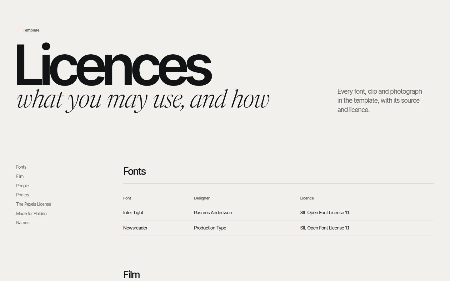
A template licence covers the template. It does not automatically cover every photo, video, icon set and font inside it. Before you buy, find out where each of those came from and whether you may use them commercially on your site.
Questions worth answering from the seller's own pages:
- Is there a licences page that lists every font, image and video with its source?
- Can you use the template for a client's site, and can you hand the finished site over to them?
- How many end products does one licence cover, and how is an end product defined?
- If you bought through a marketplace, whose licence applies?
At Frontier, every image and font in a template is either our own or free to use commercially, and each template's licences page lists them with their sources. The licence terms define an end product as one website for one business, product or person, on one domain and its subdomains. Our post on website template licences walks through the common terms across stores.
Updates, docs and formats
Three practical questions decide how much the template costs you after checkout.
Update policy
Find out whether updates are included, for how long, and how you get them. A template that is never updated slowly drifts away from its platform. Ours come with updates for life.
Start-here documentation
A good template tells you where things live: which file holds the colours, how the headers and footers are swapped, how to add a page, what to delete before launch. Look for a start-here page or a readme in the demo or the file list. A style guide page that shows every type size, colour and component is a strong sign the system underneath is consistent.
Format availability
Many templates list several formats. Read carefully which ones you can download today and which are planned. On our template pages, each format is marked as ready or soon. A Frontier template is one price, $79, for every format it ships in, and formats still in production are included when they ship. If you need Framer or Webflow today and the template only has HTML ready, buy for what is ready, not for what is promised. Our guide to choosing between Framer, Webflow, Astro and WordPress helps if you are unsure which you need.
Real copy, not lorem ipsum
Placeholder Latin hides design problems. A headline that looks perfect at four words breaks at nine, and a pricing card designed for "Feature one" overflows when it says what your plan actually includes. Templates written with real copy for a real kind of product show you honest line lengths, honest table rows and honest page structure.
Read the demo copy as if you were the buyer of the fictional product. If the pricing rows, security page and FAQ answers make sense for that category, the template author has thought about what the pages are for. Then test it with your own words. Every Frontier template page has a Try it with your brand form: enter a company name and one sentence and the template rewrites itself with your copy, so you can see your own headline in the layout before you pay.
A scoring checklist
Score each check from 0 to 2 while you click through the demo: 0 for missing or broken, 1 for partly there, 2 for done properly. Anything under about 14 out of 20 means you will rebuild a lot of it yourself.
| Check | What a 2 looks like |
|---|---|
| Page completeness | Every page on the 33-page checklist exists as a real page |
| Phone layout at 390px | No sideways scroll, usable menu, readable pricing and forms |
| Performance | Headline readable quickly on mobile data, no heavy autoplay |
| Accessibility basics | Visible focus, keyboard menu, labelled fields, reduced motion respected |
| Product mock-ups | Built as editable HTML, not flat images |
| Fonts and media licensing | A licences page lists sources, all usable commercially |
| Update policy | Updates included and clearly explained |
| Start-here docs | A start-here page or readme plus a style guide |
| Format availability | The format you need is marked ready today |
| Real copy | Category-specific copy, no lorem ipsum |
Note: Score the demo, not the sales page. Screenshots and feature lists are written to sell; the demo is the thing you will actually own.
If you are comparing stores rather than single templates, our notes on where to buy a website template cover the trade-offs, and the SaaS website templates collection is a good place to run this checklist against something concrete.
Changelog
- 2026-10-05: first published