Brutalist web design: when raw works and how to keep it usable
What web brutalism and neo-brutalism are, which brands they suit, and the usability rules that keep a deliberately raw site readable and easy to use.
Brutalist web design is a deliberately raw style: default-looking type, exposed structure, hard borders, little or no decoration, and layouts that look built rather than styled. Neo-brutalism is its friendlier, more orderly descendant, with thick black outlines, flat bright colours and hard offset shadows. Both can work for brands that want to look direct and unpolished on purpose, as long as the rawness stays visual and never leaks into navigation, contrast or forms.
A note before the details: Frontier does not sell a brutalist template today. This post is a design guide, not a sales page. Where we point to one of our templates, it is because it shares some of the discipline, and we will say exactly how far the comparison goes.
What web brutalism is
The term took hold in the mid-2010s, when designer Pascal Deville started Brutalist Websites, a curated collection of sites that shared a rough, unapologetic look. The name borrows from Brutalist architecture, where raw concrete and visible structure were the point rather than something to cover up. On the web, the equivalent of raw concrete is HTML that looks like HTML.
Typical traits of the original style:
- System fonts or monospace type, often at default sizes.
- Visible structure: borders on everything, tables, plain lists, underlined blue links.
- Few or no images, or images used bluntly, uncropped and full-bleed.
- Clashing or very limited colour, sometimes just black on white.
- Unconventional layouts that ignore the usual hero, three features and a call to action.
It started partly as a reaction against sites that all looked the same: the same rounded cards, gradients and stock photography. That is still the main reason to choose it.
Neo-brutalism: the friendlier version
The Nielsen Norman Group describes neobrutalism as a visual style defined by high contrast, blocky layouts, bold colours, thick borders and "unpolished" elements, and notes that it is more colourful and orderly than true brutalist web design. In practice you see it in product sites and apps more than in art portfolios.
Typical traits:
- Thick black outlines around cards, buttons and inputs.
- Hard drop shadows with no blur, offset down and to the right.
- Flat, saturated fills: yellows, pinks, greens, blues.
- Chunky sans-serif or grotesque type, often in heavy weights.
- A visible but conventional grid underneath.
The difference matters for usability. Original brutalism often breaks conventions on purpose. Neo-brutalism keeps conventions (buttons look like buttons, cards look like cards) and only changes how they are drawn, which is why it is much easier to ship for a product.
When it suits a brand
Raw styles are a statement. They suit brands where the statement is true.
- **Developer and technical products** whose audience trusts plain text and distrusts marketing polish.
- **Independent studios, publications and cultural projects** where personality matters more than a corporate feel.
- **Products with a strong voice** whose copy is already blunt and funny. A raw look with timid copy feels like a costume.
- **Early, scrappy launches** that want to look honest about being early.
They are a harder fit for products that ask for a lot of trust: payments, health, security, enterprise procurement. Buyers in those categories read polish as a sign of care, and a deliberately unfinished look asks them to take a leap first. It can still work, but the copy and the trust pages have to do more.
How to do it without hurting usability
The rule we would give any team: make the visuals raw, keep the interaction boring. Everything below is about the second half.
Navigation stays conventional
Put the menu where people look for it. Keep link text descriptive. Experimental layouts are fine on the home page; inner pages that people use to get something done (pricing, docs, contact) should follow familiar patterns.
Contrast is non-negotiable
Black on white and black on a saturated colour usually pass easily. The trouble comes with clashing combinations, such as bright text on a bright fill. WCAG 2.2 Contrast (Minimum) asks for 4.5:1 for normal text and 3:1 for large text, and Non-text Contrast asks for 3:1 for the visual boundaries of controls. Thick black borders help with the second one, which is a genuine strength of neo-brutalism.
Links and buttons look interactive
Underlined links are a brutalist cliché and a usability win: keep them. Buttons need a clear shape and a visible pressed and focused state. A hard offset shadow that collapses on press is a good neo-brutalist pattern, as long as there is also a focus ring for keyboard users.
.button {
  border: 3px solid #111;
  background: #ffe14d;
  color: #111;
  box-shadow: 4px 4px 0 #111;
}
.button:active {
  transform: translate(4px, 4px);
  box-shadow: none;
}
.button:focus-visible {
  outline: 3px solid #111;
  outline-offset: 3px;
}
@media (prefers-reduced-motion: reduce) {
  .button:active { transform: none; }
}
Type stays readable
Monospace at default size makes a striking headline and a tiring paragraph. Use the raw face for display text and labels, and a readable face, reasonable size and measure for anything longer than a few lines.
Layout survives small screens
Overlapping, rotated or absolutely positioned elements are the usual way brutalist layouts break on phones. WCAG 2.2 Reflow asks that content works at a width of 320 CSS pixels without scrolling in two directions. Build the experimental desktop layout on top of a simple single-column flow, not the other way round.
Forms are plain
Labels above inputs, clear errors in text, generous targets. Raw styling is fine; raw behaviour is not.
Brutalism versus Swiss style
People often put brutalism and Swiss style side by side, because both expose structure, use grotesque type and keep colour limited. The difference is intent. Swiss style uses the grid to make information calm and clear. Brutalism uses exposed structure to make a point and is happy to be uncomfortable.
If what draws you to brutalism is the exposed grid, heavy type and one loud colour, but you need a site that sells to cautious buyers, a disciplined Swiss layout gets you some of the way. Our closest template is Foray. To be clear about the comparison: Foray is Swiss, not brutalist. It uses a 12-column grid ruled in ink, Schibsted Grotesk set large, one signal yellow from Sanzo Wada combination 62, and motion kept to wipes along the grid. Its third home page is a yellow poster with a single yes key, which is about as loud as the system gets.
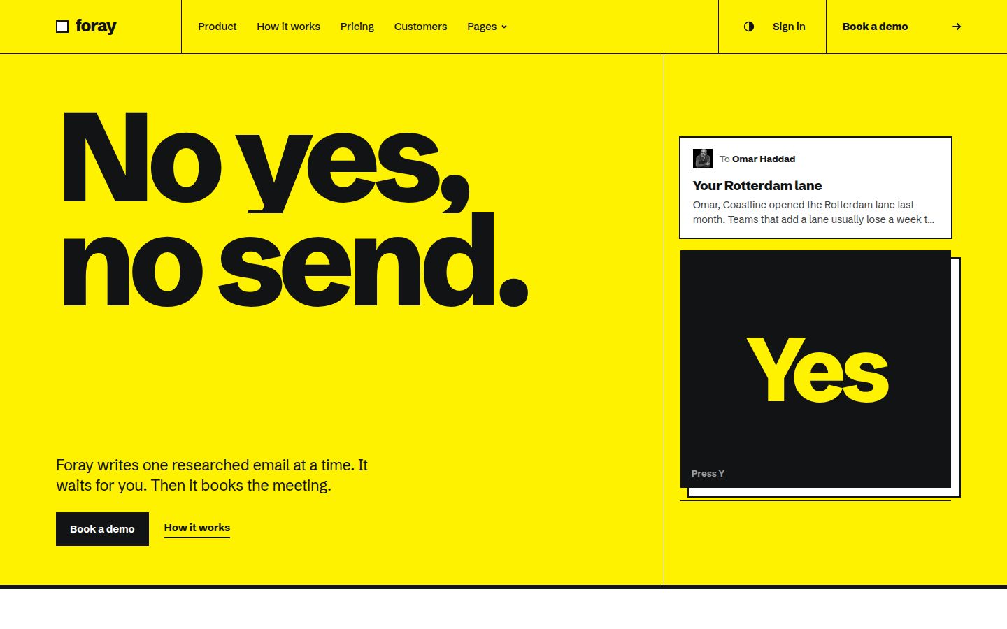
What it does not do is break conventions. Navigation, pricing and forms behave the way buyers expect, and the forms ship with success and error states. If you want hard offset shadows, clashing colours and a deliberately awkward layout, you would be restyling it heavily, and a blank project may be the faster route.
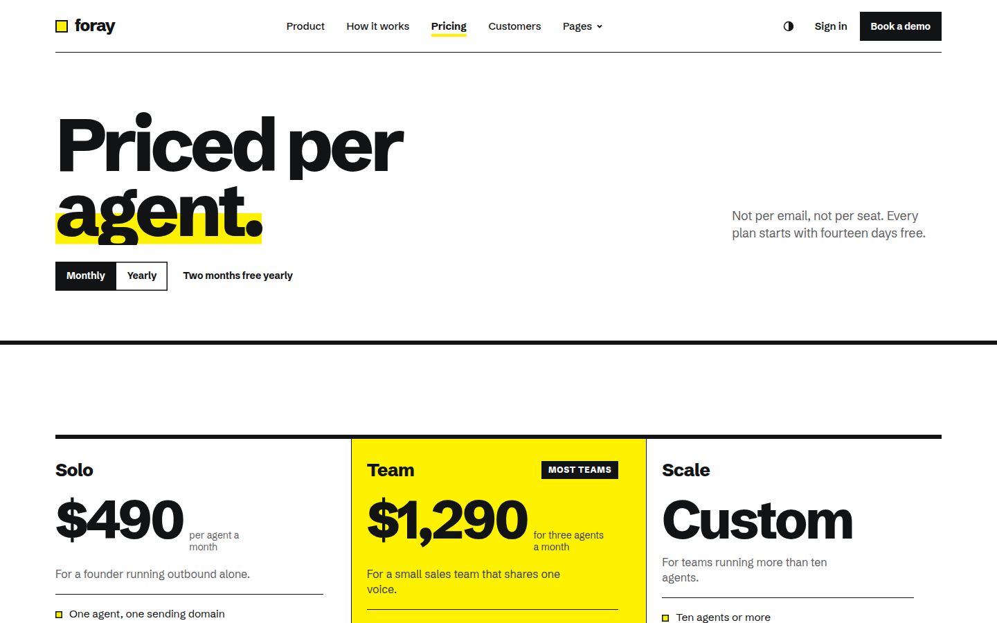
You can read more about the system behind it in our guide to Swiss style web design.
Building your own brutalist site from a template
If you start from any template, brutalist or not, the parts that save the most time are rarely the visual style. They are the pages and states: pricing with a comparison, sign-in and sign-up, a 404, forms with errors, a changelog. Our complete template checklist lists them. Restyling a complete template is usually faster than building those pages from scratch in a raw style, because the raw style is mostly CSS: borders, shadows, colours and type.
A practical order of work:
- Pick a base with solid structure and semantic HTML. The HTML website templates collection is the easiest to restyle by hand.
- Replace the type tokens first: a grotesque or monospace display face, a readable body face.
- Replace colour tokens with your flat palette, and check every text and control pair for contrast.
- Add borders and hard shadows at the component level, not page by page.
- Experiment with layout on the home page only, and test it at 320 CSS pixels wide.
- Run the accessibility checklist before launch.
If you are working with a coding agent, a template with design tokens is especially handy, since you can ask it to swap the token values and rebuild the components; our guide to editing a template with Claude Code shows that workflow.
The short version
Brutalism and neo-brutalism are honest styles when the brand behind them is blunt, technical or independent, and they are easy to get wrong when the rawness spreads to how the site works. Keep navigation familiar, contrast high, links underlined, forms plain and layouts reflowable, and the look can be as loud as you like. We do not have a brutalist template in the catalogue; if a Swiss grid is close enough, Foray is the nearest thing, and if it is not, start from a well-structured template and restyle it.
Changelog
- 2026-10-05: first published