# Dark mode for marketing sites: how to design it properly
> How to build a real dark theme for a marketing site: token sets, elevation by lightness, contrast in both themes, accents, images and no flash on load.
By the Frontier team. Published 2026-10-05, updated 2026-10-05.
A proper dark mode is a second set of design tokens, not an inverted stylesheet. You define every colour as a custom property, give dark mode its own values (deeper surfaces that get lighter as they rise, softened text, accents retuned for a dark background), check contrast in both themes, and apply the chosen theme before the first paint so nobody sees a white flash. The prefers-color-scheme media feature picks the default and the color-scheme property keeps browser UI in step.
Marketing sites get this wrong more often than apps, because the dark theme is often added late, after the light design is approved. The result is pure black backgrounds, glowing white text, accents that vibrate, and product screenshots that suddenly look like holes in the page. Here is how to do it so both themes feel designed.
## Start with tokens, not overrides
The cheapest dark mode is a block of overrides that flips a few colours. It breaks the first time someone adds a component. The durable version is a token set: every colour in the site comes from a named custom property, and each theme assigns values to the same names.
```
:root {
color-scheme: light dark;
--bg: #f7f5f0;
--surface-1: #ffffff;
--surface-2: #f0ede6;
--text: #16181a;
--text-muted: #55595e;
--line: #d9d5cc;
--accent: #c2410c;
--on-accent: #ffffff;
}
:root[data-theme="dark"] {
color-scheme: dark;
--bg: #121416;
--surface-1: #1a1d20;
--surface-2: #23272b;
--text: #ecebe7;
--text-muted: #a4a7ab;
--line: #33383d;
--accent: #fb8c4b;
--on-accent: #16181a;
}
:root[data-theme="light"] { color-scheme: light; }
```
Name tokens by role (background, surface, text, line, accent), never by colour. A token called --white that holds a dark grey in dark mode is a bug waiting to happen.
Components then use only tokens. If a designer reaches for a hex value inside a component, that is a sign a token is missing.
## Elevation by lightness
In a light theme, shadows tell you what is on top. On a dark background shadows barely show, so dark themes signal elevation with lightness instead: the page is the darkest layer, cards are a step lighter, and menus and dialogs a step lighter again. That is why the token set above has more than one surface.
A few rules that hold up:
- Avoid pure black for the page background. A very dark grey or a tinted near-black gives you room to go darker for inset areas and makes elevation steps visible.
- Keep steps small but consistent. Two or three surface levels are enough for a marketing site.
- Use borders more than in light mode. A one-pixel line in a mid-dark tone separates cards cleanly where a shadow would vanish.
- If you keep shadows, make them larger and darker, or swap them for a subtle glow in the accent colour on focused elements.
## Contrast in both themes
Both themes have to pass the same bar. WCAG 2.2 [Contrast (Minimum)](https://www.w3.org/TR/WCAG22/#contrast-minimum) requires 4.5:1 for normal text and 3:1 for large text, and [Non-text Contrast](https://www.w3.org/TR/WCAG22/#non-text-contrast) requires 3:1 for control boundaries and meaningful graphics. Dark themes tend to fail in two specific places:
- **Muted text.** The grey that reads as secondary on white often drops below 4.5:1 on a dark surface, especially on the lighter elevated surfaces.
- **Accent text and buttons.** A saturated brand colour that passes on white can fail as text on near-black, and white text on a light accent fails in the other direction.
At the other end, pure white text on near-black is technically high contrast but can feel harsh for long reading. Pulling the main text colour down slightly to an off-white keeps it comfortable while still passing easily.
Check contrast per token pair, not per page: text on bg, text on each surface, muted text on each surface, on-accent on accent. If each pair passes in both themes, every component built from them does too.
## Accents per theme
Brand colours rarely work unchanged on both backgrounds. Plan an accent value per theme:
- Lighten and slightly desaturate accents for dark mode, so they do not vibrate against the background.
- Give the text that sits on an accent (the --on-accent token) its own value per theme; a dark label on a bright accent is often the better dark-mode choice.
- Reconsider what the accent is for. In dark mode a bright accent draws the eye more strongly, so it can do more work with less area: focus rings, the primary button, one highlighted number.
## Images, illustrations and product shots
Images are where a dark theme most often looks unfinished.
- **Product screenshots.** A light-mode screenshot on a dark page is a glaring rectangle. Either ship dark versions, or build product visuals as HTML that uses the same tokens, so they switch with the theme.
- **Logos and icons.** Use SVG with currentColor, or provide light and dark variants with a picture element and a media query on prefers-color-scheme.
- **Photographs.** Most photos are fine. Very bright ones can be toned down slightly in dark mode with a filter such as brightness(0.9), but test the effect, since it also darkens the parts you wanted to show.
- **Embedded SVG files.** MDN notes that an SVG loaded via an img element can use [prefers-color-scheme](https://developer.mozilla.org/en-US/docs/Web/CSS/Reference/At-rules/@media/prefers-color-scheme) internally, based on the color-scheme of its parent element, which lets one file serve both themes.
## Apply the theme before the first paint
The classic dark mode bug is the flash of the wrong theme: the page renders light, then JavaScript notices a saved dark preference and switches. The fix is to decide the theme in a tiny inline script in the head, before anything paints, falling back to the system setting when there is no saved choice.
```
```
Three details make this robust:
1. It runs inline in the head, not in a deferred file, so it executes before first paint.
2. The localStorage read is wrapped in try/catch, because storage can be blocked, and the script falls back to the system setting.
3. The toggle writes to the same key, so the visitor's choice wins over the system on later visits.
The color-scheme declarations matter too. MDN's [color-scheme](https://developer.mozilla.org/en-US/docs/Web/CSS/Reference/Properties/color-scheme) reference explains that the property tells the browser which schemes an element can render in, and that the browser then adapts the canvas surface, scrollbars, form controls and other built-in UI to match. Without it, you can end up with a dark page, a white scrollbar and light default inputs. MDN also notes that color-scheme alone does not restyle your own elements; prefers-color-scheme and your tokens do that.
## Examples: five templates with real dark themes
Five Frontier templates ship light and dark token sets: [Halden](templates/halden.html), [Meetly](templates/meetly.html), [Tidewell](templates/tidewell.html), [Foray](templates/foray.html) and [Foldline](templates/foldline.html). They share the approach described above: both themes are CSS custom properties, with dark values under :root[data-theme=dark]; on a first visit the theme follows the system setting through prefers-color-scheme; and the toggle remembers the visitor's choice in localStorage. Each one makes its own dark-mode decisions, which is the useful part.
**Foldline** is styled as folded paper, and its dark theme is inked paper: a dark olive (#191b17) rather than a neutral grey, so the paper metaphor survives the switch. Its light and dark modes come from one token file.
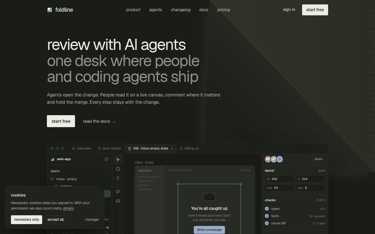
*Foldline, Home V1, dark mode*
**Foray** is a Swiss-style template with one signal yellow (#fff200). In dark mode its inverted panels go deeper rather than turning white, and the signal yellow becomes the focus and shadow colour. That is accents per theme in practice: the yellow does more work, in less area.
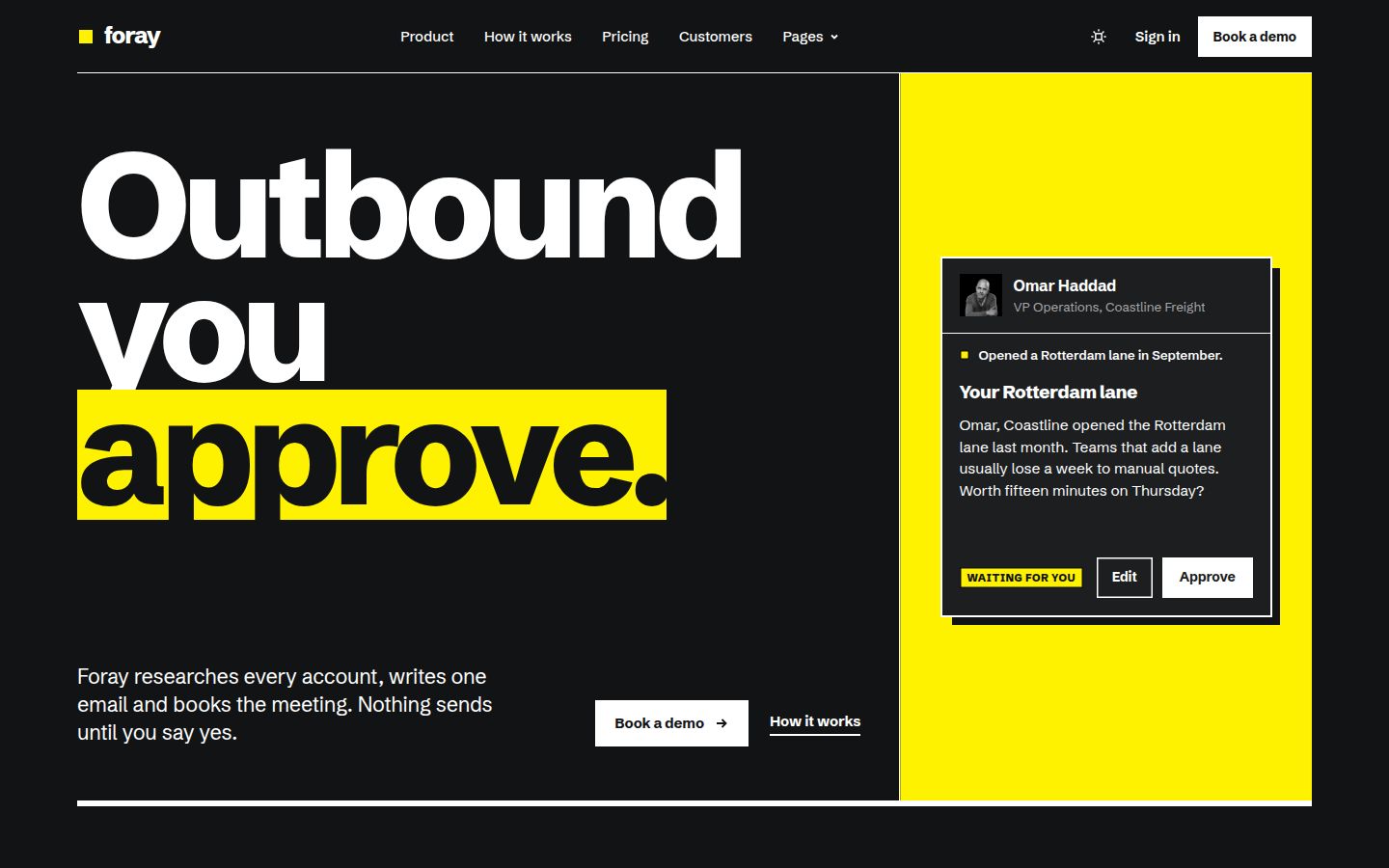
*Foray, Home V1, dark mode*
**Tidewell** is a glass template. In its night-tide dark mode the glass becomes a faint white tint (rgb 255 255 255 at 0.06 alpha) over #15171c, so panels stay visible as lighter layers, which is elevation by lightness applied to a translucent style. We cover that in more depth in our [glassmorphism guide](blog/glassmorphism-web-design.html).
**Halden** and **Meetly** build their product visuals as HTML rather than images: Halden's agent, eval, API and review mock-ups, and Meetly's recap, transcript, tasks and Ask-your-meetings mocks. That sidesteps the screenshot problem, since the visuals are markup that can follow the page's tokens rather than flattened light-mode pictures.
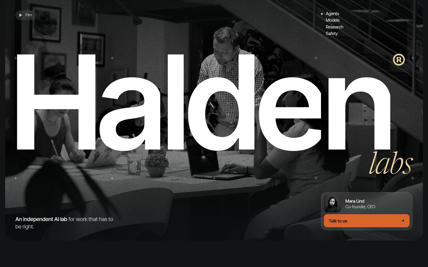
*Halden, Home V1, dark mode*
All five are in the [dark mode website templates](collections/dark-mode-website-templates.html) collection, and all ship as HTML today.
Template: [foldline](https://frontiertemplates.com/templates/foldline)
## A short checklist before you ship
- Every colour comes from a token, and every token has a value in both themes.
- Page background is not pure black; surfaces get lighter as they rise.
- Text, muted text and accent pairs pass contrast on every surface, in both themes.
- Focus rings are visible in both themes.
- Product visuals, logos and icons have dark versions or follow the tokens.
- The theme is applied before first paint, with a fallback when storage is blocked.
- color-scheme is set, so scrollbars and form controls match.
- The toggle has an accessible name and its state is announced.
For the rest of the accessibility basics, from landmarks to reflow, use our [website template accessibility checklist](blog/website-template-accessibility-checklist.html). And if you are still choosing where to build, [Framer, Webflow, Astro or WordPress](blog/framer-webflow-astro-wordpress.html) all handle theming differently, which is worth knowing before you buy.
Canonical: https://frontiertemplates.com/blog/dark-mode-for-marketing-sites